Shadows in the Rain
An application that visualizes hurricanes from 1800 to 2010.
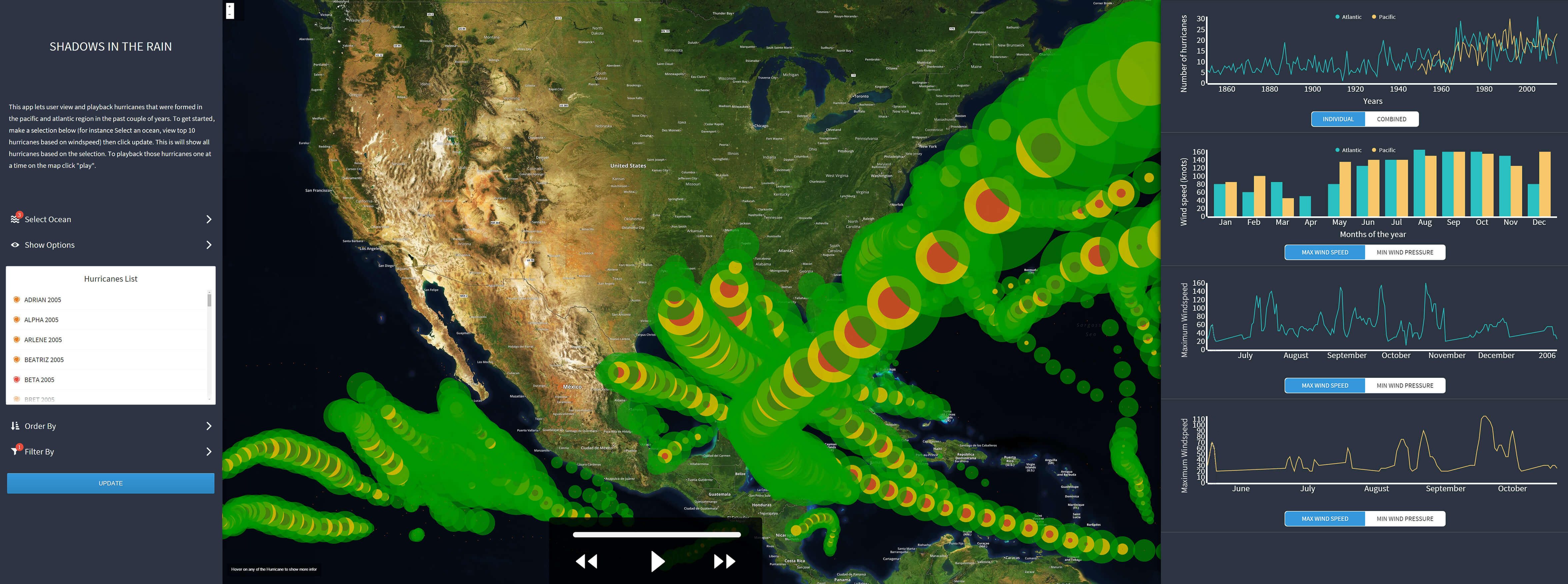
An overview of the application showing the plotted hurricanes and their corresponding graphs.
An application that visualizes hurricanes from 1800 to 2010.
An overview of the application showing the plotted hurricanes and their corresponding graphs.
Shadows in the Rain was our course project for CS-424 Visualization and Visual Analytics at the University of Illinois at Chicago. This course was offered by the Electronic Visualization Laboratory (EVL). EVL also offers other cross courses between the School of Computer Science and the School of Design at UIC.
Product Design, UX, and Data Visualization.
September-October 2015.
Gautam Krishnan, Srivatsan Muralidharan, Sumanth Pandugula, and Vivek Krishnakumar, under the guidance of Prof. Andrew E Johnson.
Product Design, UX, and Data Visualization
September-October 2015.
Ideation, User Research, Prototyping, Visual Design, User Testing, and Front-end UI Code.
Shadows in the Rain is a web application to analyze the regions in the US most likely to be affected by hurricanes. It plots and plays back hurricanes from the 1800s to 2010 in the Atlantic and Pacific oceans on a map, showing the intensity, damage, and their real-time progress.
The EVL boasts a state-of-the-art multitouch display known as the SAGE2. It has an astounding resolution of 8160 x 2304 pixels and comprises 18 individual displays (in a 6x3 layout). This large screen is built to facilitate collaboration and group-oriented problem-solving. The teams for this course project were expected to present their application on this screen in a full-screen mode, scaled appropriately.
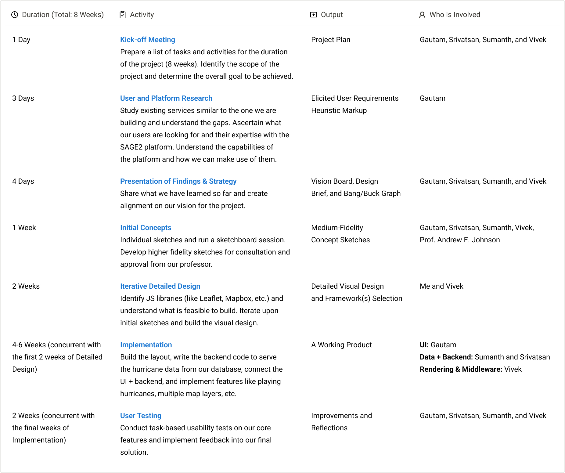
We had eight weeks to complete and present our project, so we decided that the best way to achieve our goal was to plan each activity with a deadline. There were some unknown unknowns, like the data quality and what/how to clean up 200K+ rows of data.
We had to plan tasks according to our backgrounds and strengths. Srivatsan and Sumanth were the most experienced with handling data and databases, while Vivek was into writing front-end JavaScript. My expertise is in conducting UX activities and building UI, so we all had our parts cut out from the beginning as we built the team.
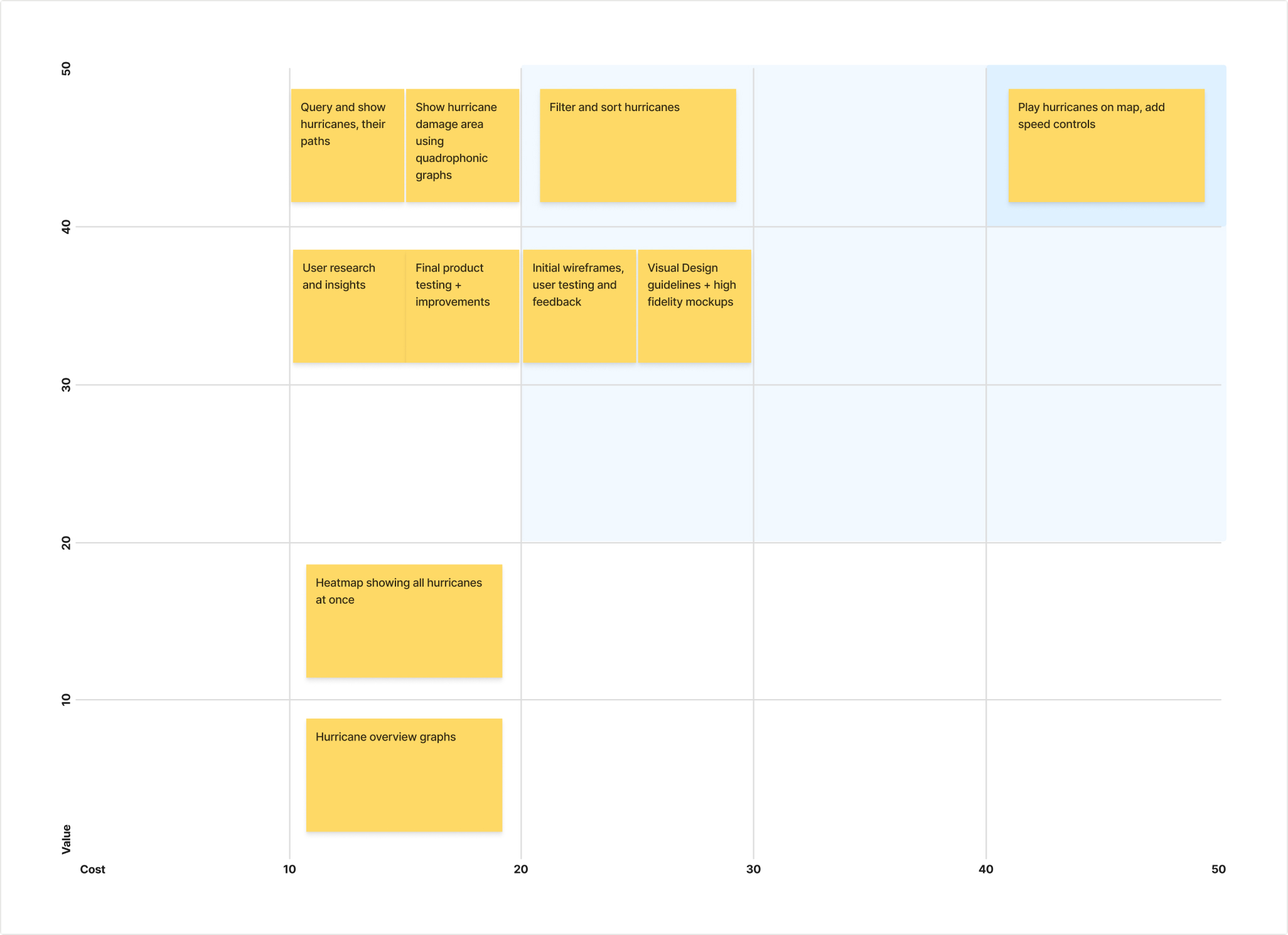
Bang/buck exercise to identify the value and cost of tasks.
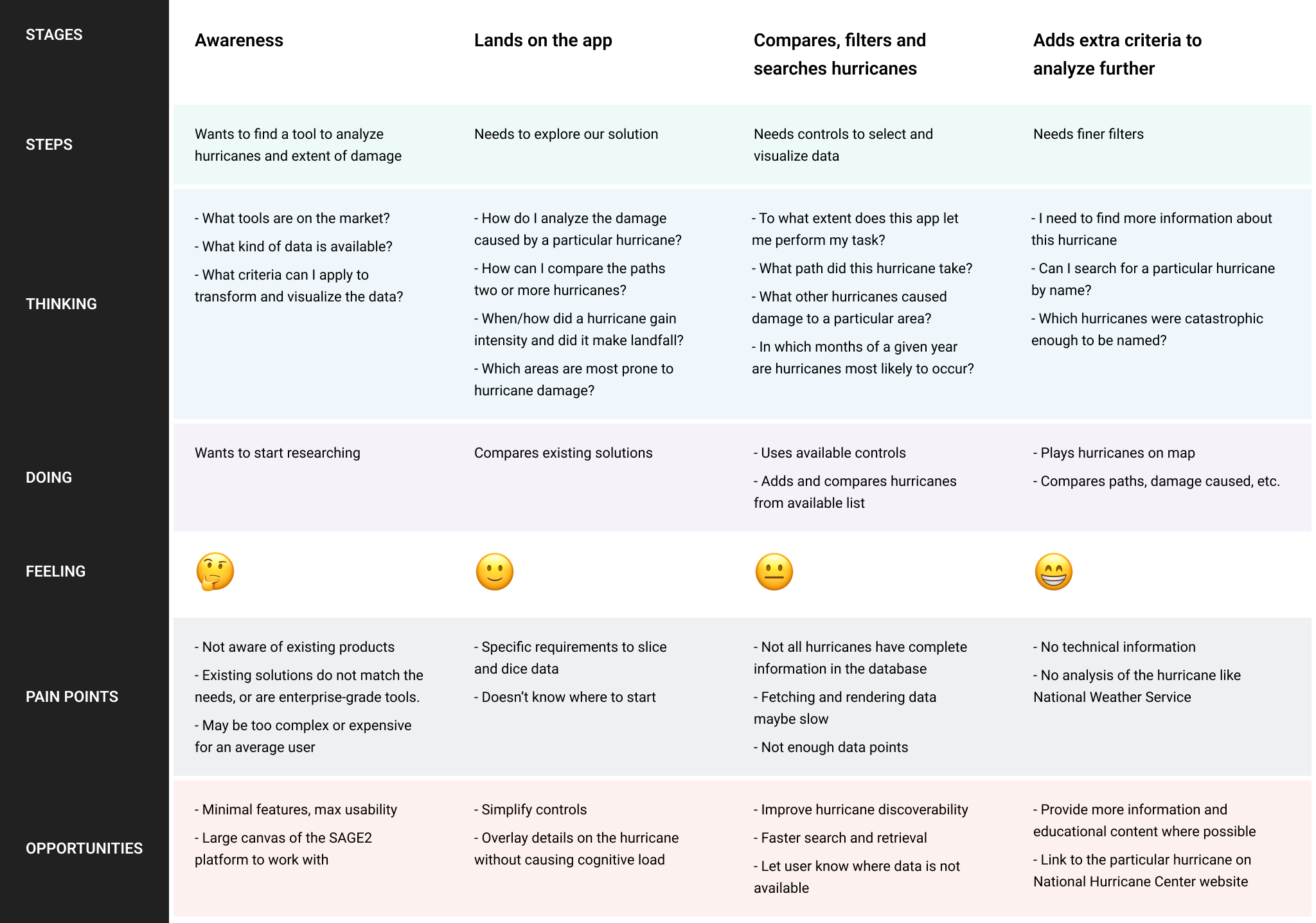
We started by conducting interviews with the faculty and research students at EVL. We interviewed them for two different things: Their expertise with SAGE2 and familiarity with hurricane-related terminologies.
We tried to understand how well our audience knew about SAGE2 and its capabilities, as it would be used by our audience to interact with our application. We found that three different types of audiences exist:
Our goal was to consider all these user groups and build an interface that would offer a complete and uncompromised experience for all.
UIC offers a BS, MS, and Ph.D. in Earth and Environmental Sciences (EES) under the College of Liberal Arts and Sciences. The courses are designed to train the students in interdisciplinary earth science, laboratory investigations, and computational modeling and simulation of big data. Since we were working on a project that was closely related to EES, we had the opportunity to interview a few students from that discipline.
While our team was getting familiar with all the hurricane-related terminologies in our project, we found that the students from an EES background had no problem understanding them. We saw them as our power users who could understand the application at a conceptual level. They could answer a lot of our questions on the factors and parameters that affected the hurricanes, and how the factors themselves were interdependent.
About 90% (19/21) of the users had not used the multitouch feature on SAGE2. Some described as being aware of the capability but did not have the opportunity to use it.
I remember reading about it on the EVL website but haven't come across any app that supports it. In fact, you can't tell which app supports multitouch and which doesn't.
Have seen a demo in the course I took but never used it.
I generally avoid the touch feature because it involves being too close to the giant screen almost my height, which makes content hard to read.
About 75% (16/21) of the users reported that they were unfamiliar with any tool to analyze weather-related data. Although some EES students had used the forecasting tool by National Hurricane Center (NHC). they could not recollect if the NHC tool offered any means to analyze past hurricane data. We were introduced to this tool by the EES students and some aspects of it were useful to us in understanding hurricane representations.
"Confusion and clutter are failures of design, not attributes of information. And so the point is to find design strategies that reveal detail and complexity - rather than to fault the data for an excess of complication. Or, worse, to fault viewers for a lack of understanding."
- Edward Tufte
The datasets provided to us were a list of hurricanes and their related parameters from both the Atlantic and Pacific oceans (about 100,000 rows of data). As a team, we were tasked with creating a web application to help users analyze historical data.
Due to climate change and increasing global sea levels, we are witnessing an increase in hurricanes every year and the damage caused. In this project, we analyzed and built a model to show how geographical locations have been increasingly affected in the past years. We can use this data to predict the areas most vulnerable to hurricanes in the future.
How this is currently done:
After collecting feedback and gaining a better understanding of the problem, we developed a value proposition about the necessity and direction for our app.
Shadows in the Rain is a tool that lets users study the effects of past hurricanes to make better predictions about the extent and areas of damage they could cause in the future.
Our product helps
Who need a better way to
By
And is better than
Because
There were a few course-specific requirements that our application had to fulfill:
How can we make the app intuitive for all audiences, particularly the
EVL and EES students?
Although this was a part of our course, how can we make our solution more
like a finished, polished product and less like a school project?
Since the SAGE2 platform supports both touch and keyboard/mouse interfaces,
how do we make our interface accessible for both these modes?
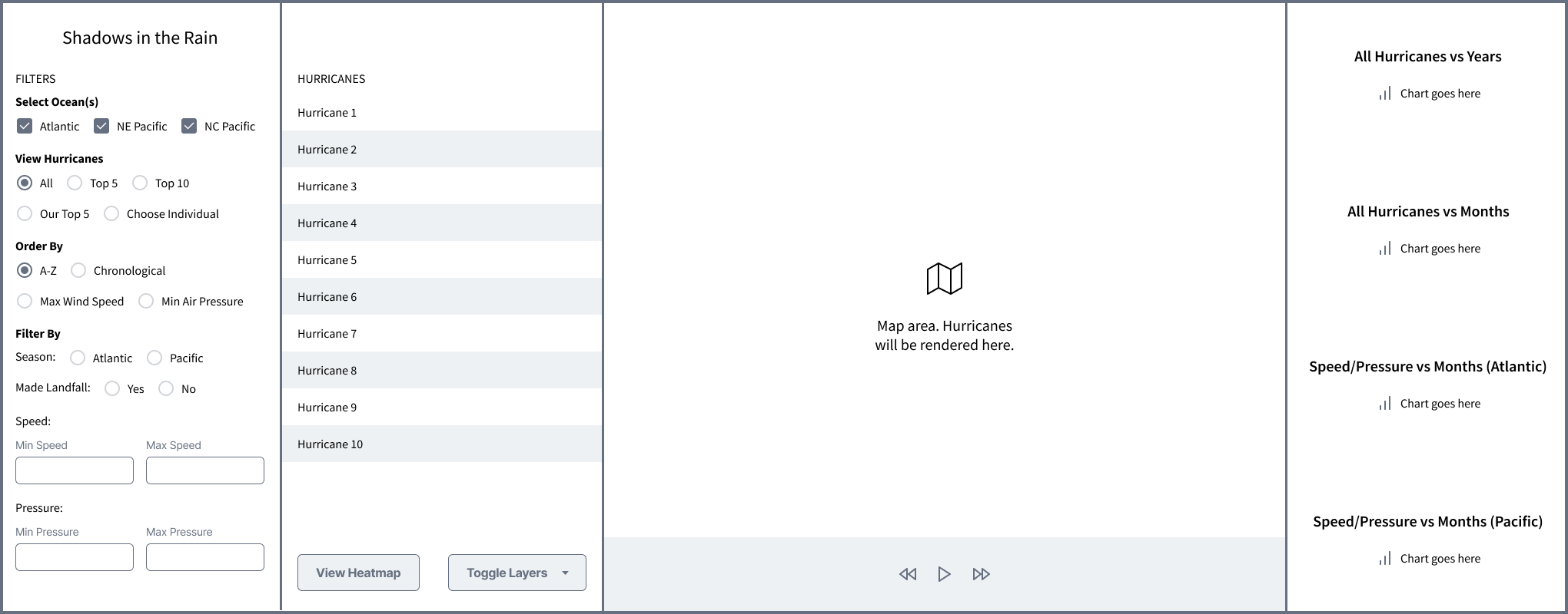
Our initial lo-fi wireframe.
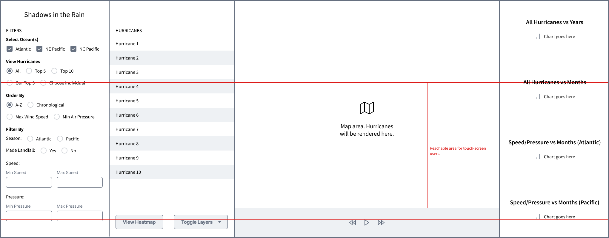
We simulated this wireframe on the SAGE2 display and found that certain areas of the application were not accessible for the touch-screen users.
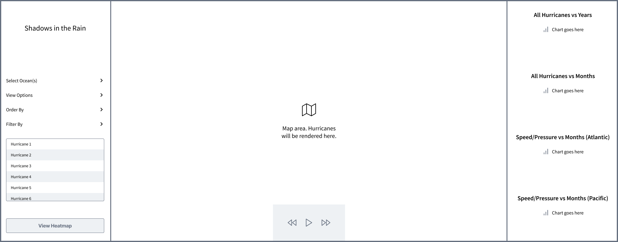
Finalized wireframe after addressing the issues we found.
After testing our application with the users and upon viewing the projects that were presented by other teams in class, we had a lot of take aways. Here are some items that would be our priority in the future and would enrich the features that we already have: