Campaign Center
Creation and management of insurance campaigns in a Vitech SaaS application.
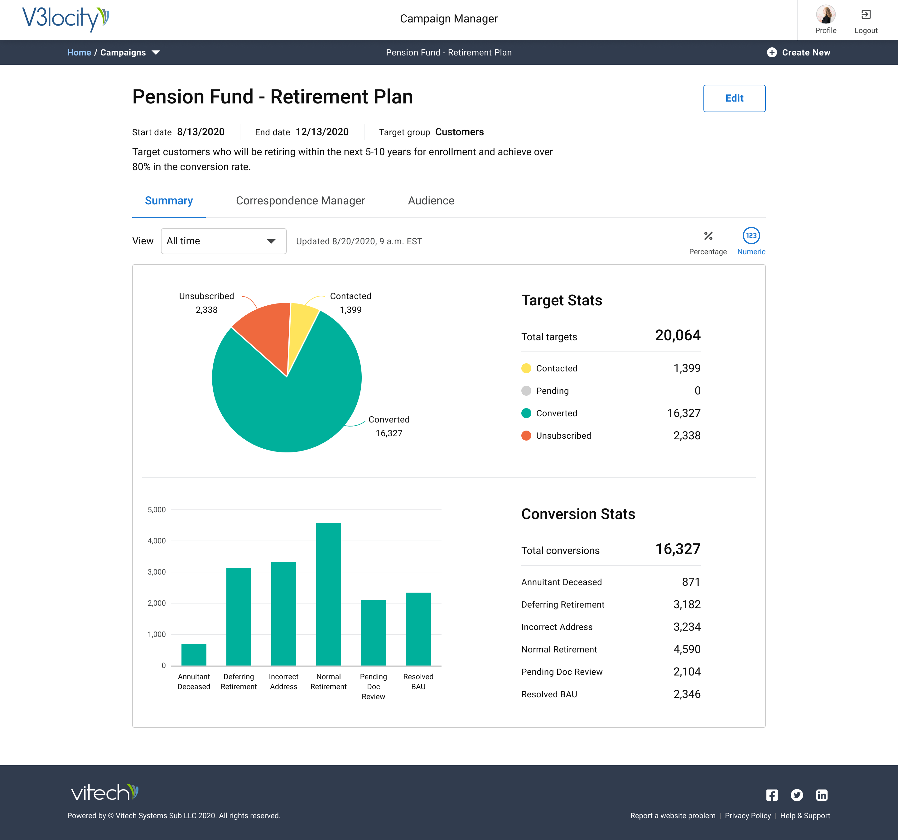
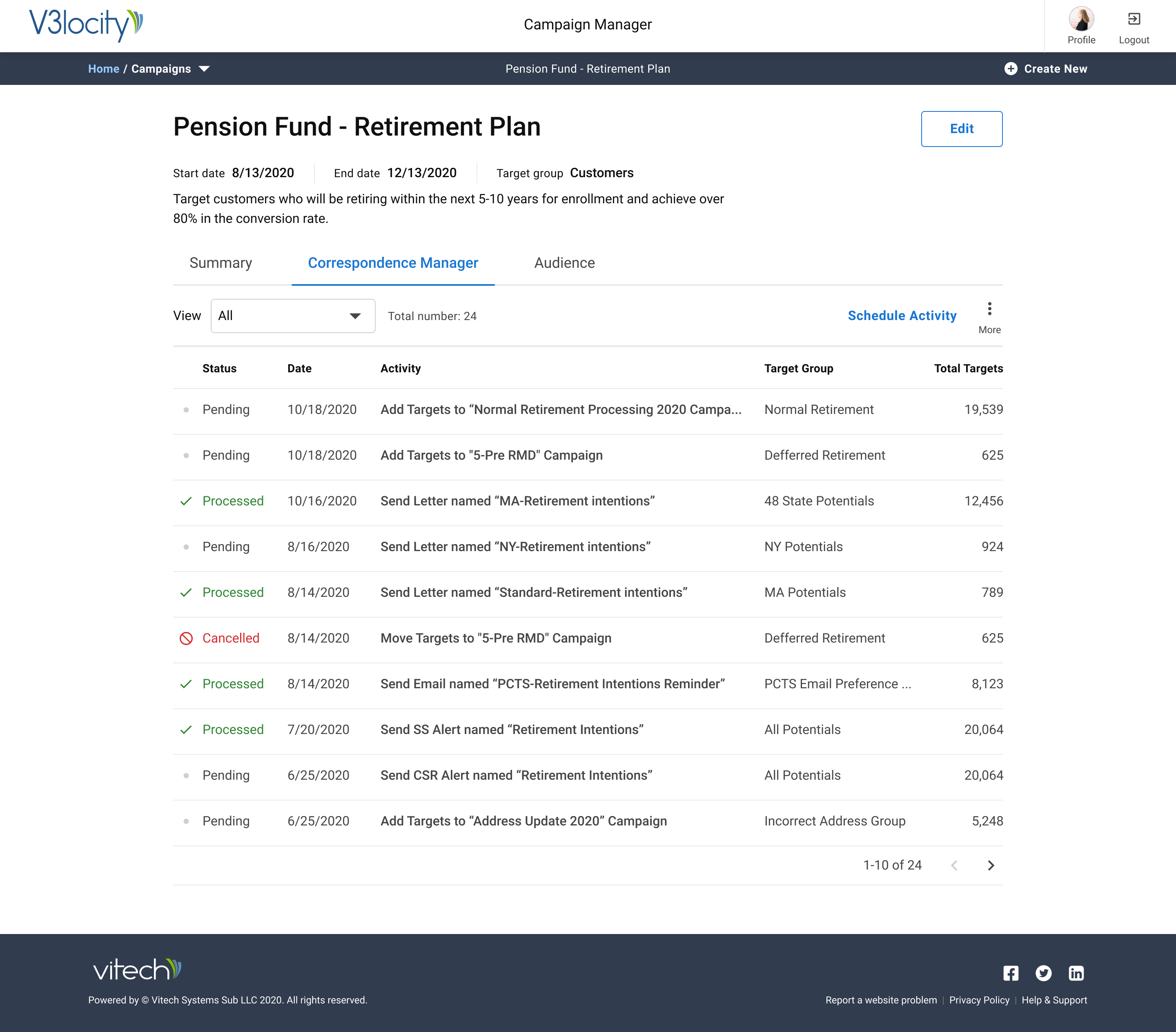
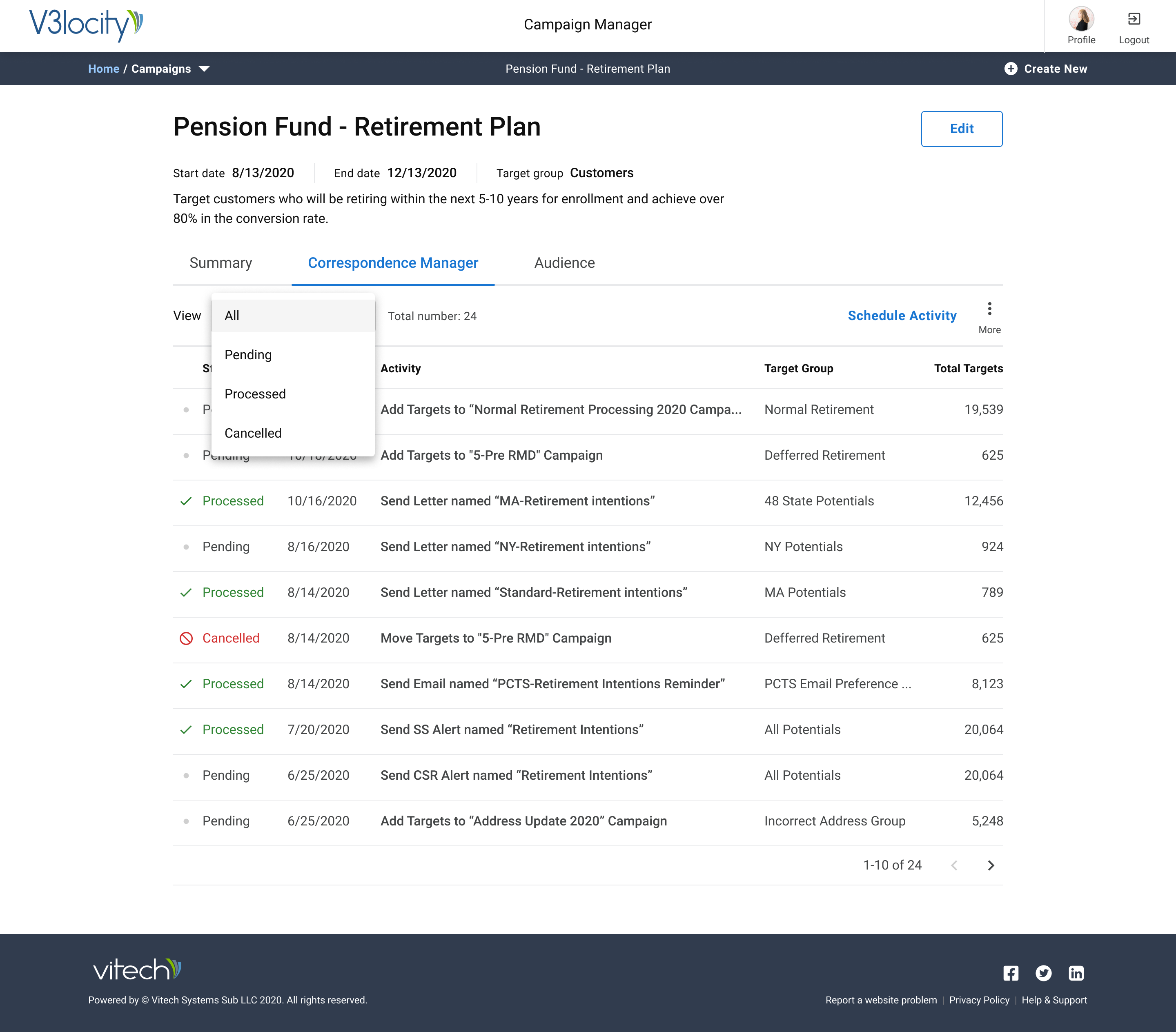
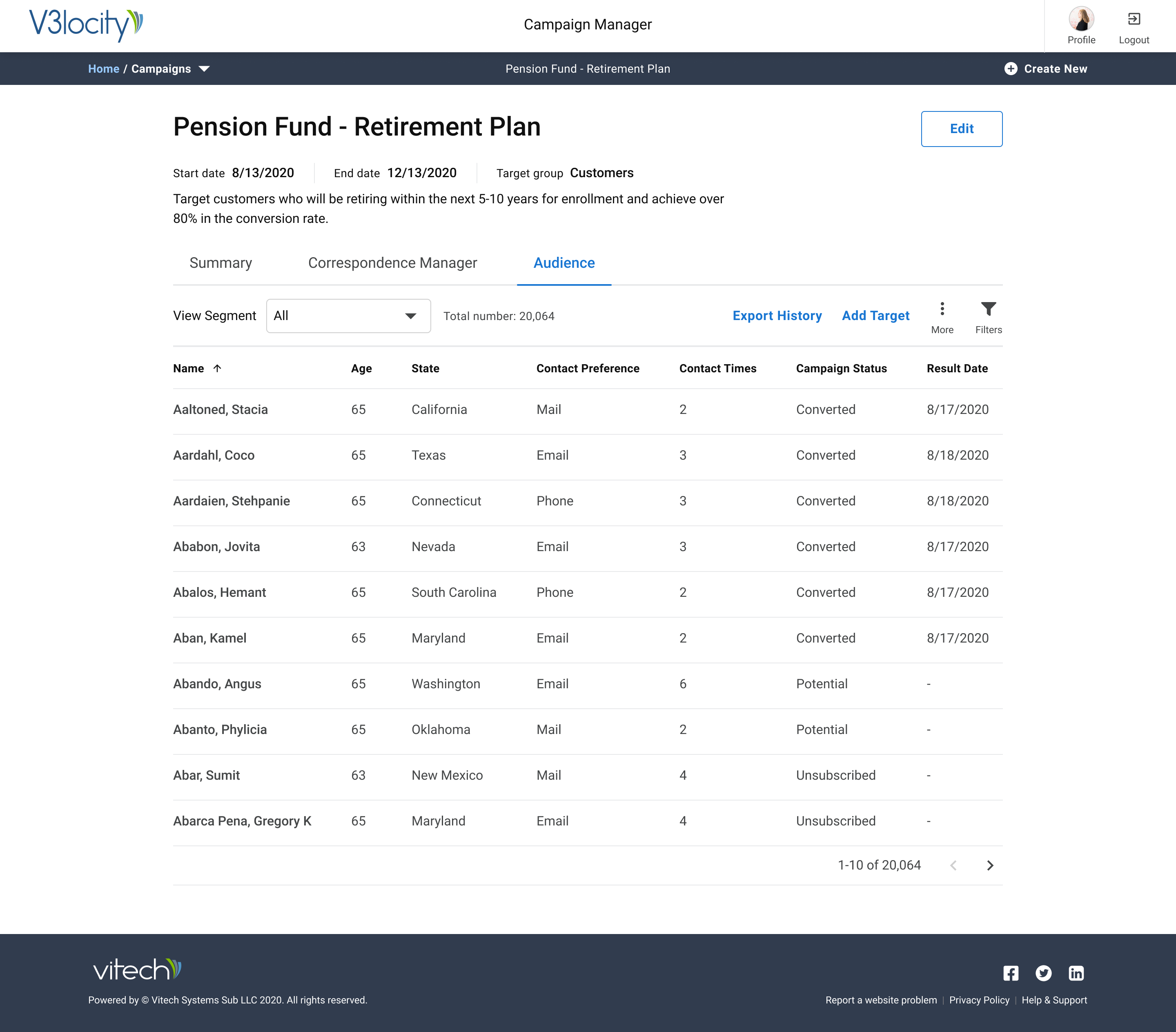
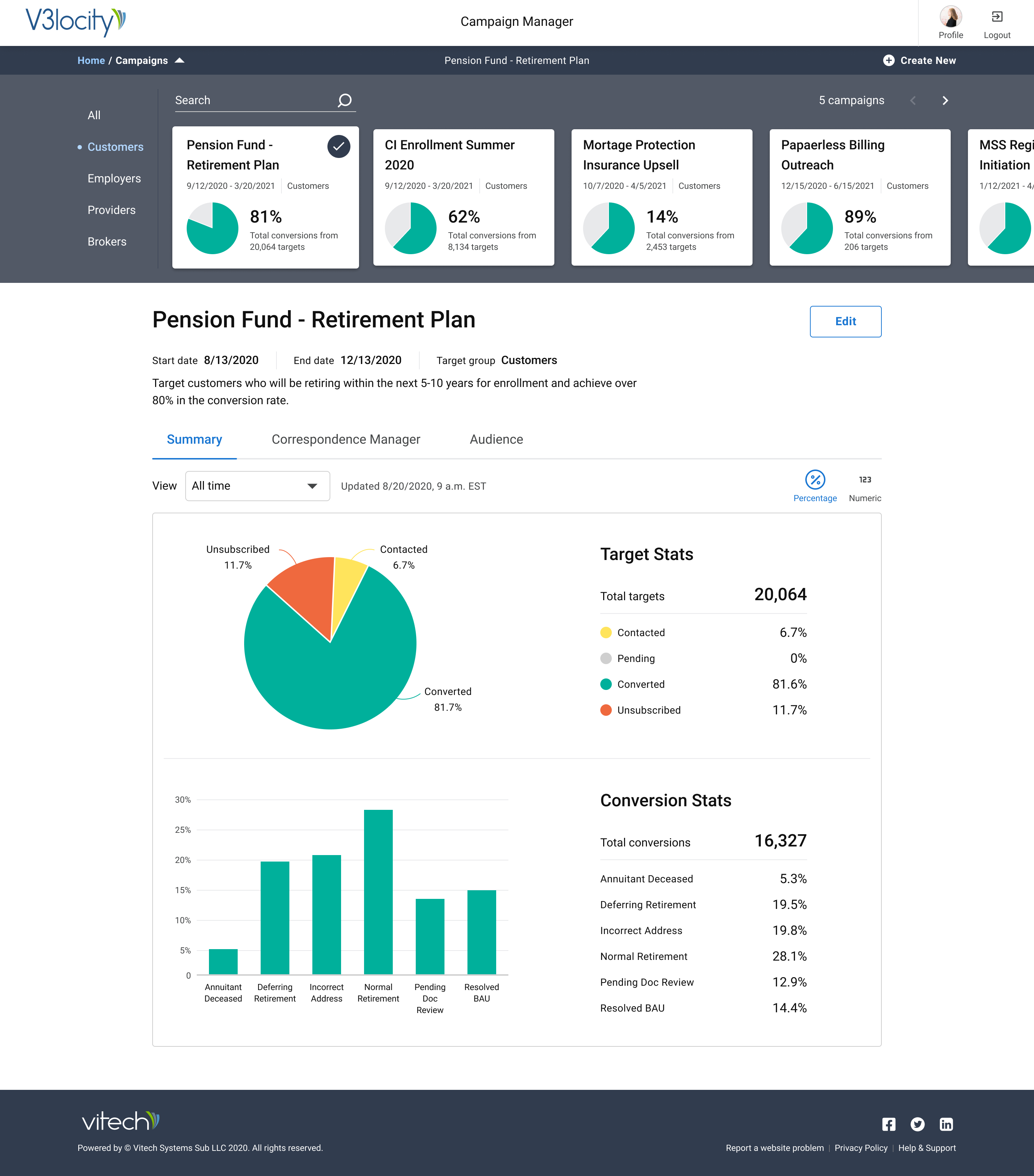
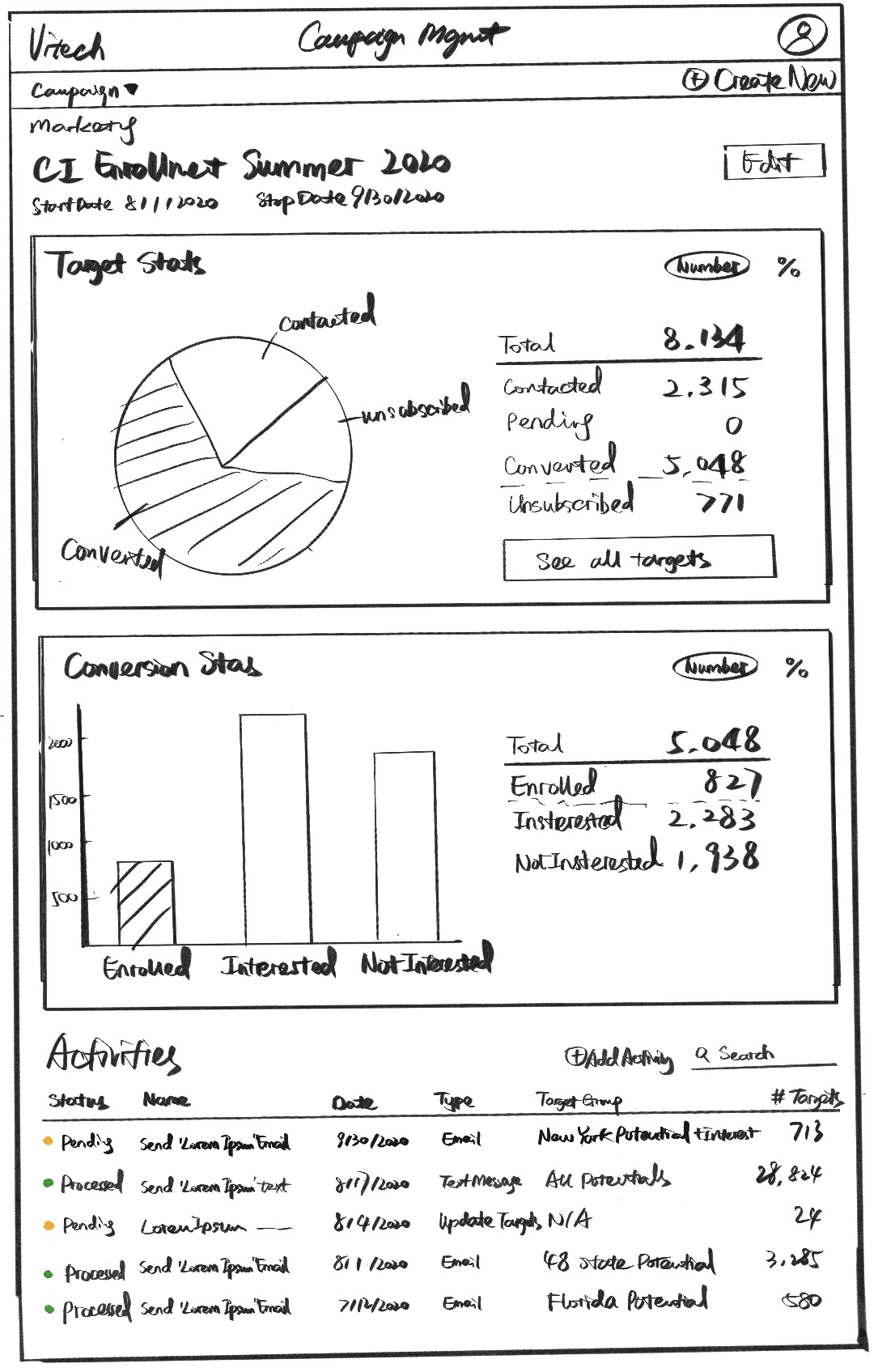
An overview of the application showing an existing active campaign.
Creation and management of insurance campaigns in a Vitech SaaS application.
An overview of the application showing an existing active campaign.
Campaign Center is a product at Vitech that enables our customers in the insurance industry to launch targeted campaigns to achieve goals like enrollment, upselling insurance products, and more.
Product Design, UX, and Data Visualization.
January - August 2021.
Product Managers: Hayden Jarboe, Ciara O'Riordan, and Mahbubul Haque. UX Team: Emm Pakdee (Director of UX), Gautam Krishnan, and Yujie Zhu (Sr. UX Designers). Engineering (Framework) Team.
Figma Design, FigJam, InVision, Balsamiq Mockups, and React.js.
Ideation, Research, Prototyping, Visual Design, and User Testing.
Vitech broadly serves three industrial verticals - Insurance, Investments, and Retirement. For the clients in our insurance segment, their entire claims processing happens on Vitech's platform. They currently need to export their user data from our platform and import it into other third-party campaign builders. With their data living in the Vitech platform, the product team identified that we could empower our customers to maximize their revenue and engagement by building a campaign feature right into the platform.
Vitech's next-generation React platform is a robust framework that serves as a base for all our new self-service apps. We use React Material under the hood that is modified to serve Vitech's Design System components.
We have a mix of qualitative data from SMEs, direct customer requests, as well as feedback from a lot of product demos. They have, at times, shown to be leading indicators for market needs. To note specific examples:
We looked at various SaaS campaign builders and were inspired by Hive, Monday.com and Airtable.


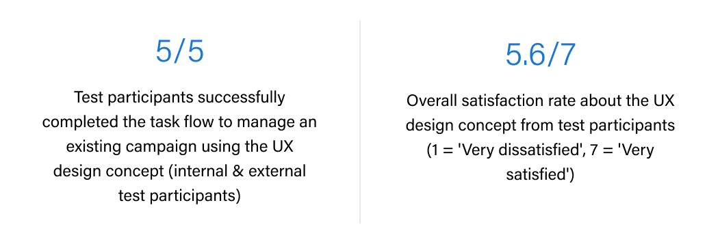
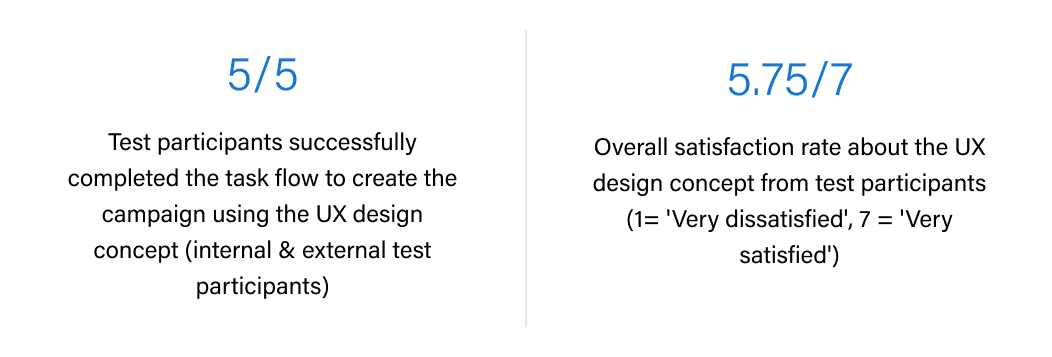
We will consider the product to be a success when:
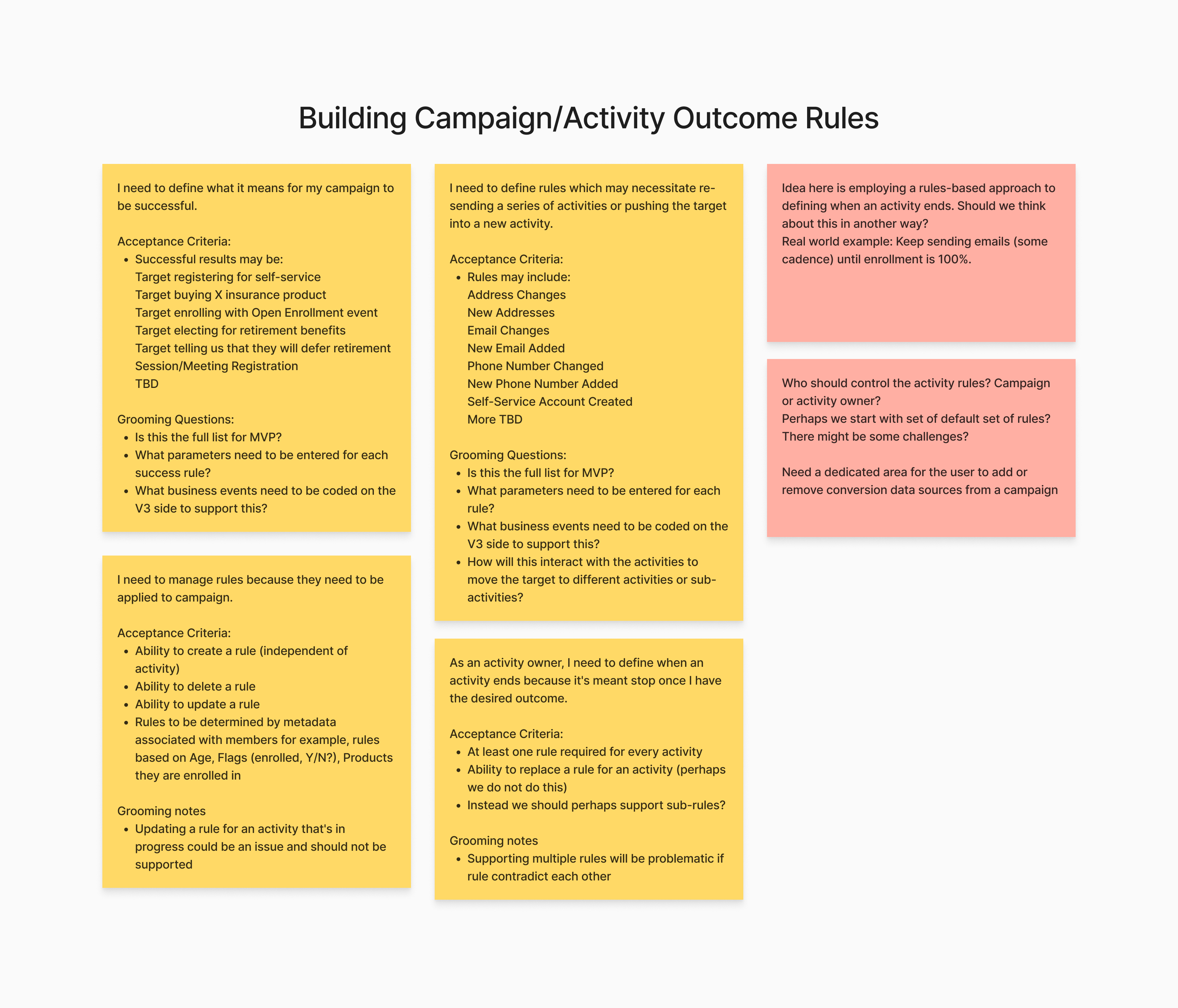
Our customers' business processes are manual labor intensive (like claim adjudication, claim adjustments, etc.) and require multiple activities. Each of these activities can require its result conditions which result in subprocesses. Our greatest opportunity and success would be to automate and manage these processes which in turn (the hypothesis) can help our clients support their larger goals.
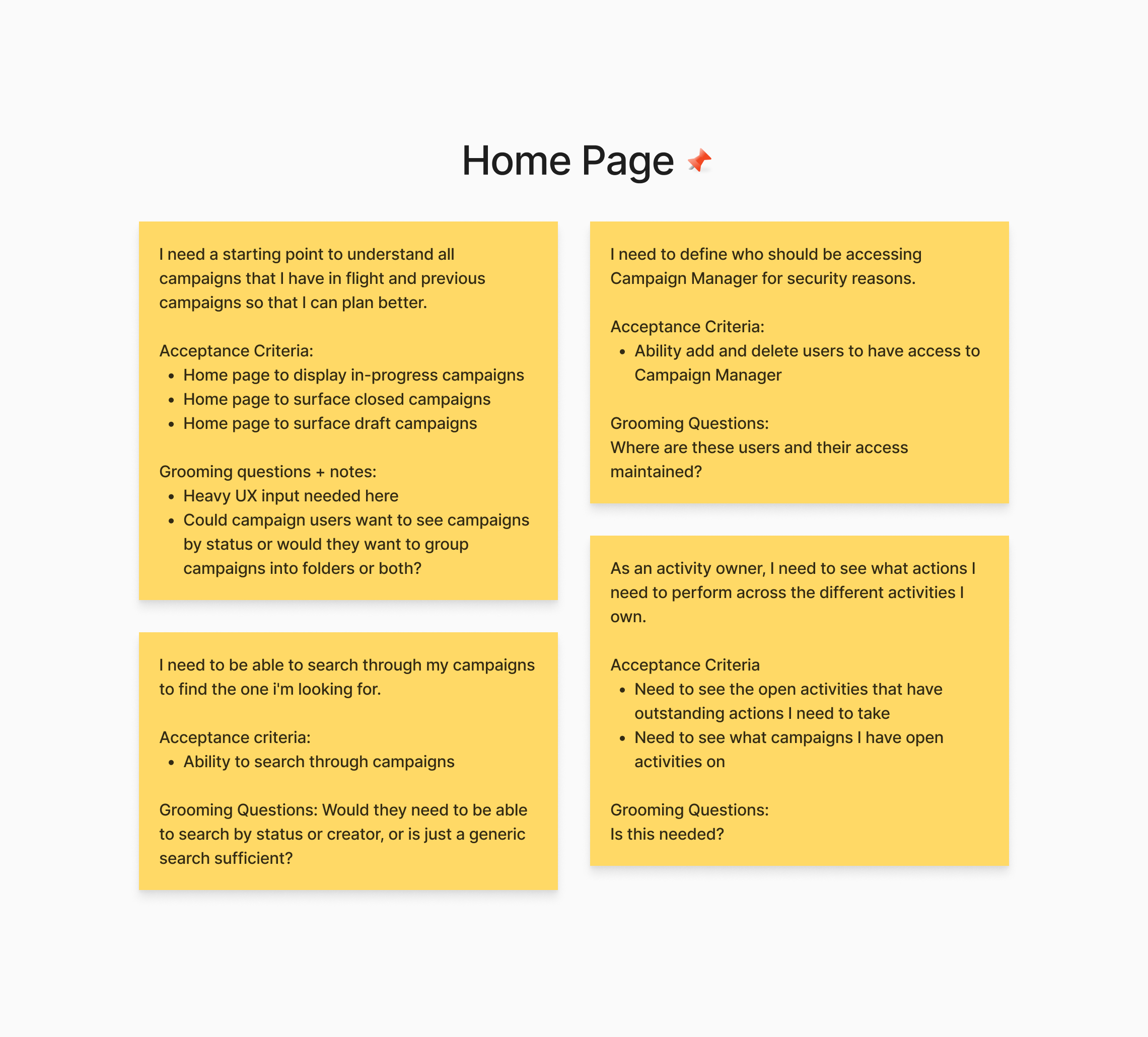
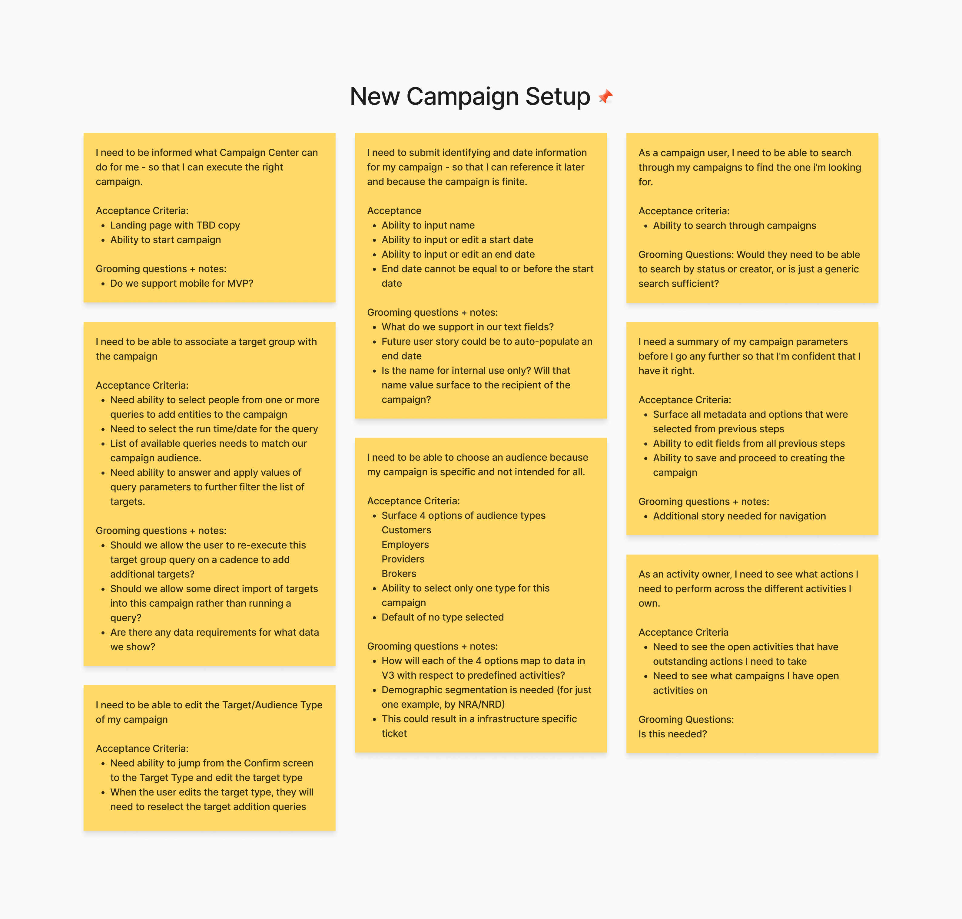
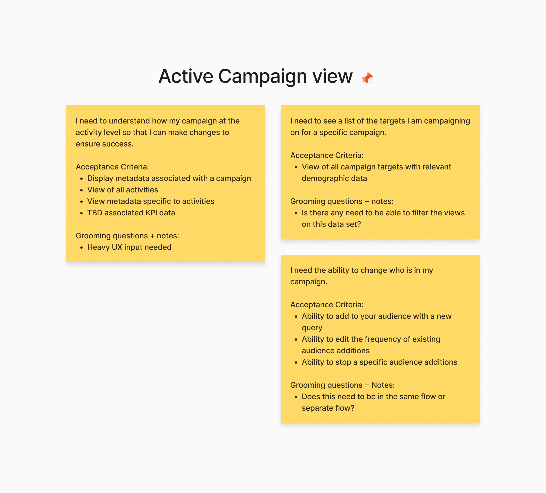
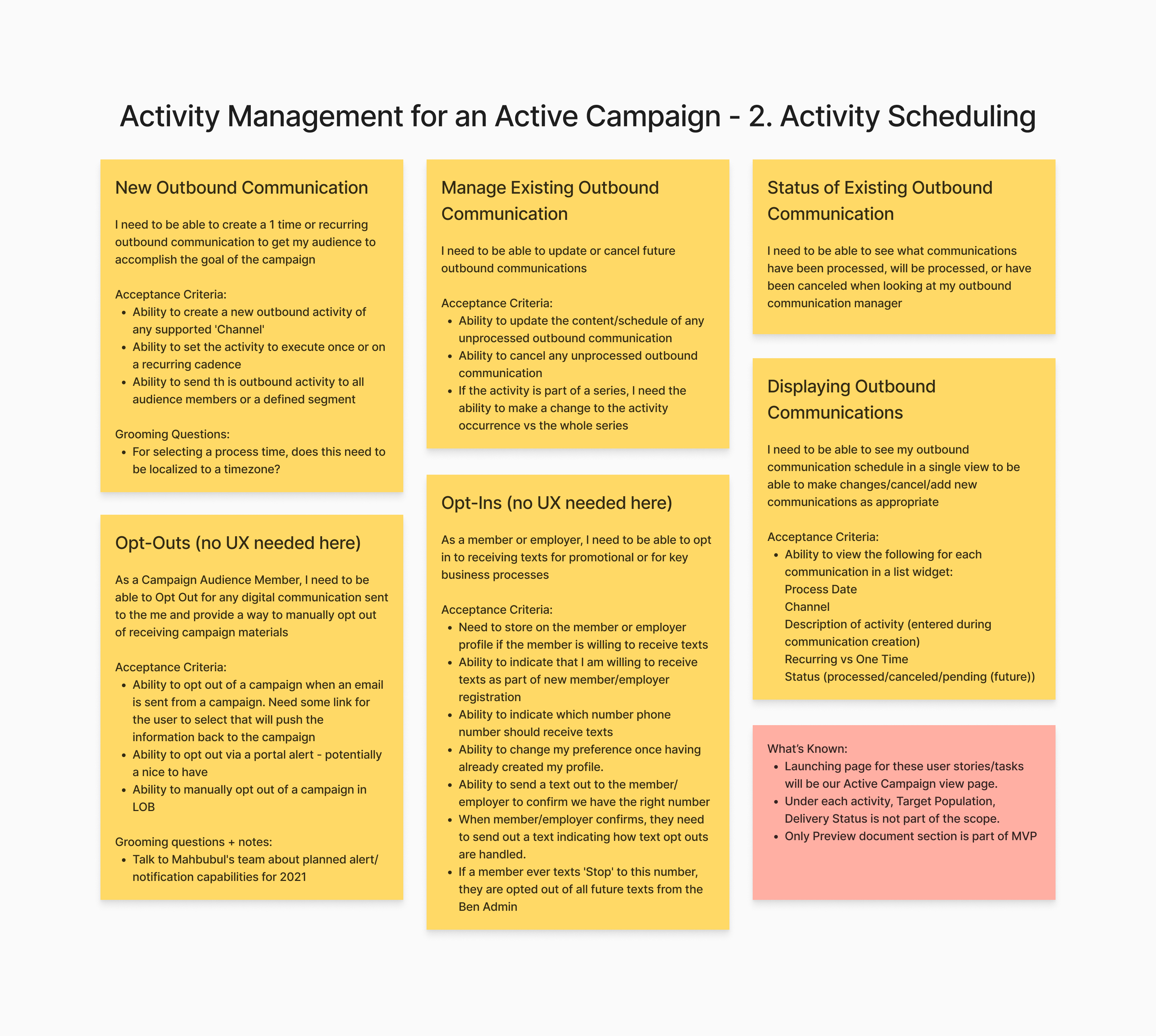
After interviewing our customers' employees who work on creating campaigns, we were able to further define the requirements and create epics to work on. We broke it down as follows:

"Pay attention to what users do, not what they say."
- Jakob Nielsen
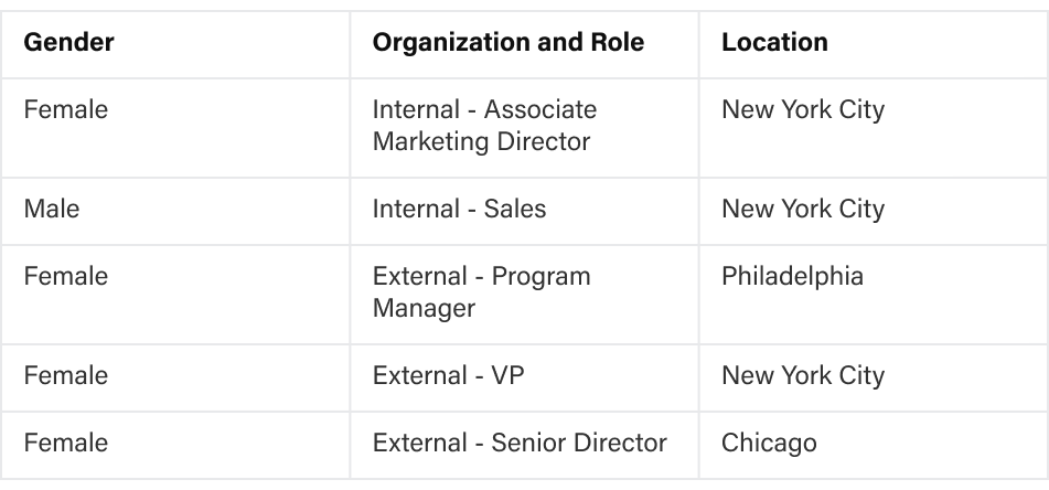
Before we drop in, I want to remind you will be walking through a clickable prototype rather than actual software. This means we have simulated some functionalities and not others. If you click somewhere and something doesn't happen or if you clicked somewhere and multiple things happen, it doesn't mean you clicked in the wrong spot, it just means that we didn't simulate that portion. If you get stuck, we want to hear your thought process as to why you are stuck, I may step in to nudge you in a direction if we need to move on to other sections of the design.
I am going to give you some background on your user role and the area of the Campaign Center tool we are in then give you a series of tasks to perform. Please remember to think out loud as much as possible so we can get insight into how you perceive the tool and the design concept. If you are ready, let's go ahead and get started.
From our last user testing session, we went through and set up the backbone of a campaign. Now let's take it a step further, you have gone through and created the campaign and several outbound activities (emails, messages, letters) associated with the campaign. You are going to be a user for one of our pension funds, your goal is to navigate around and perform several actions on the inflight campaign.
Here are the tasks you need to execute to accomplish this goal:
Great, we're finished with the bulk of the test. You mentioned [something they said out loud perhaps?] earlier and I didn't want to jump in at that time. Can you say more about that?
On a scale of 1-7, how would you rate the experience of using the design?
What are 3 adjectives that come to mind when thinking about your experience with the design?
We worked on several wireframes individually, reviewed and voted our work, and finalized on the following items:
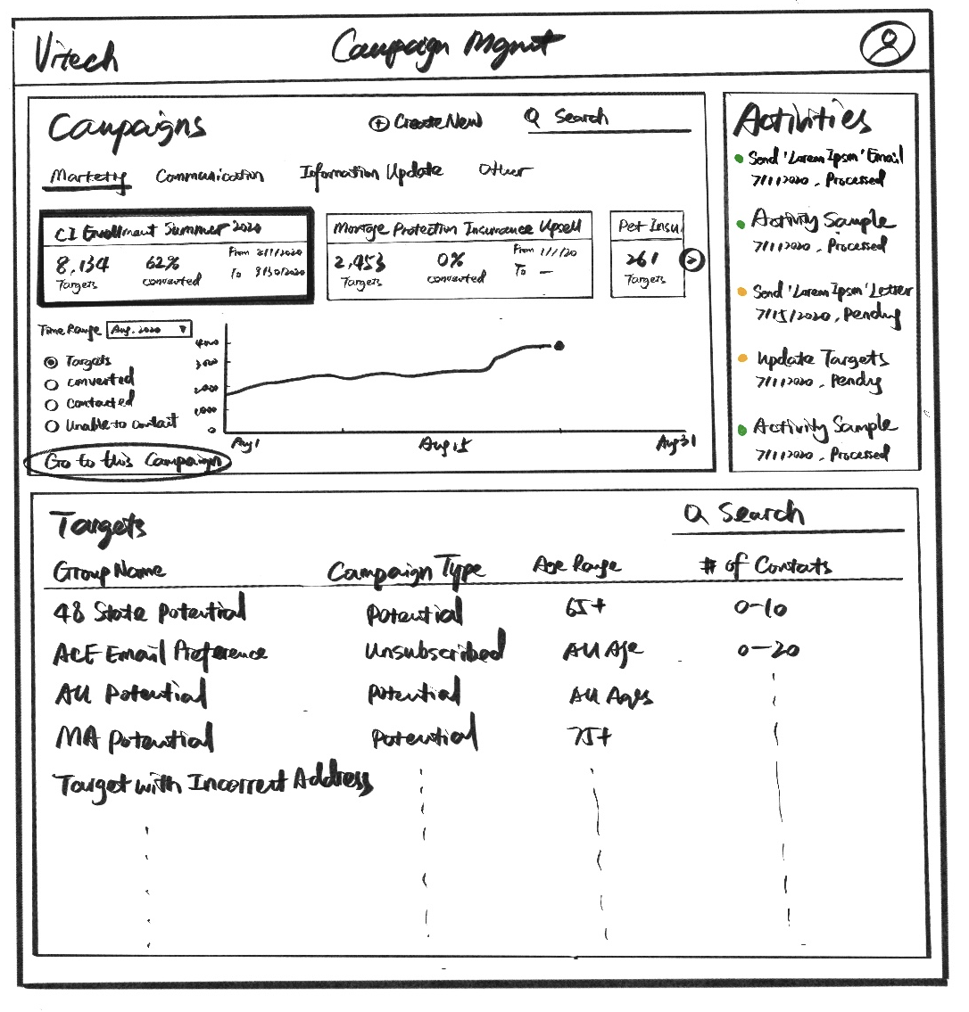
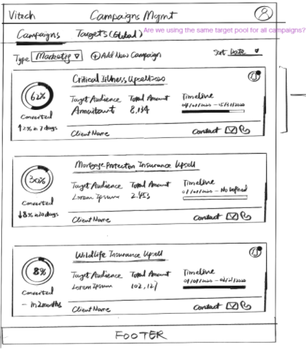
To test our ideas with users and other stakeholders, we worked on a few low-fi mockups to validate the direction and feasibility within the current engineering framework.
"If you think good design is expensive, you should look at the cost of bad design."
- Ralf Speth, CEO, Jaguar Land Rover
We were able to validate a lot of our hypotheses and understood where we fell short.
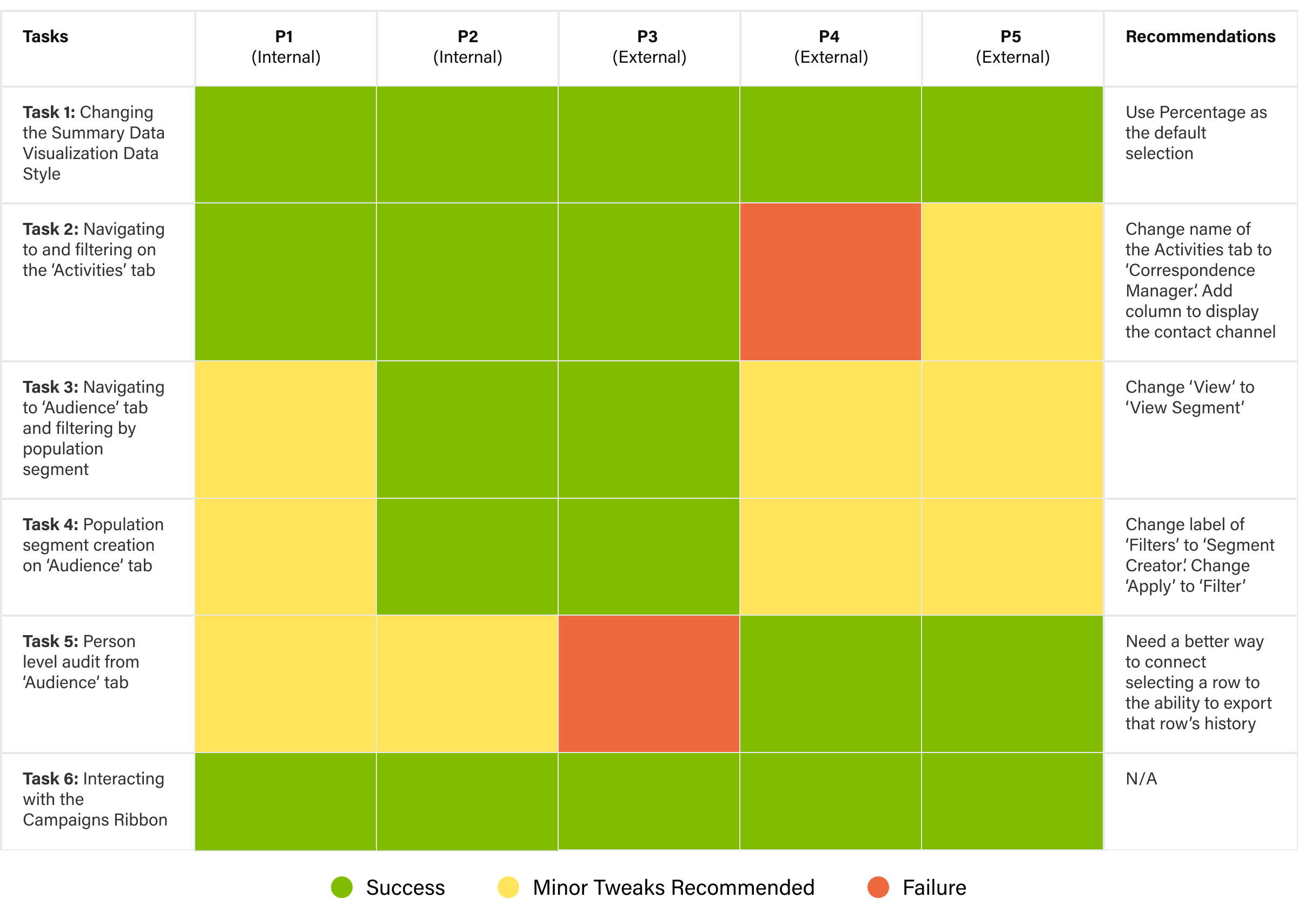
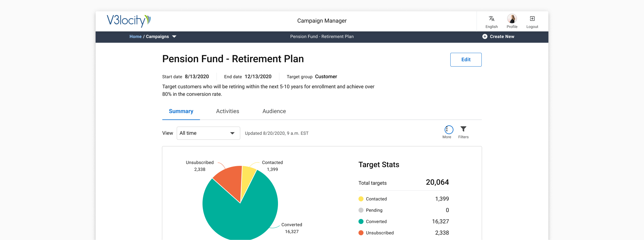
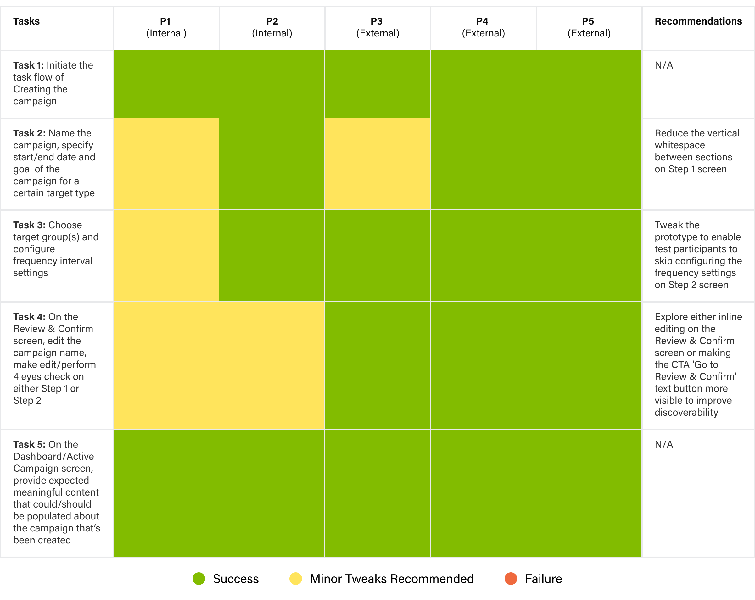
Traffic Light Report Summary of Tasks Performed by Test Participants via UX Design Concept.
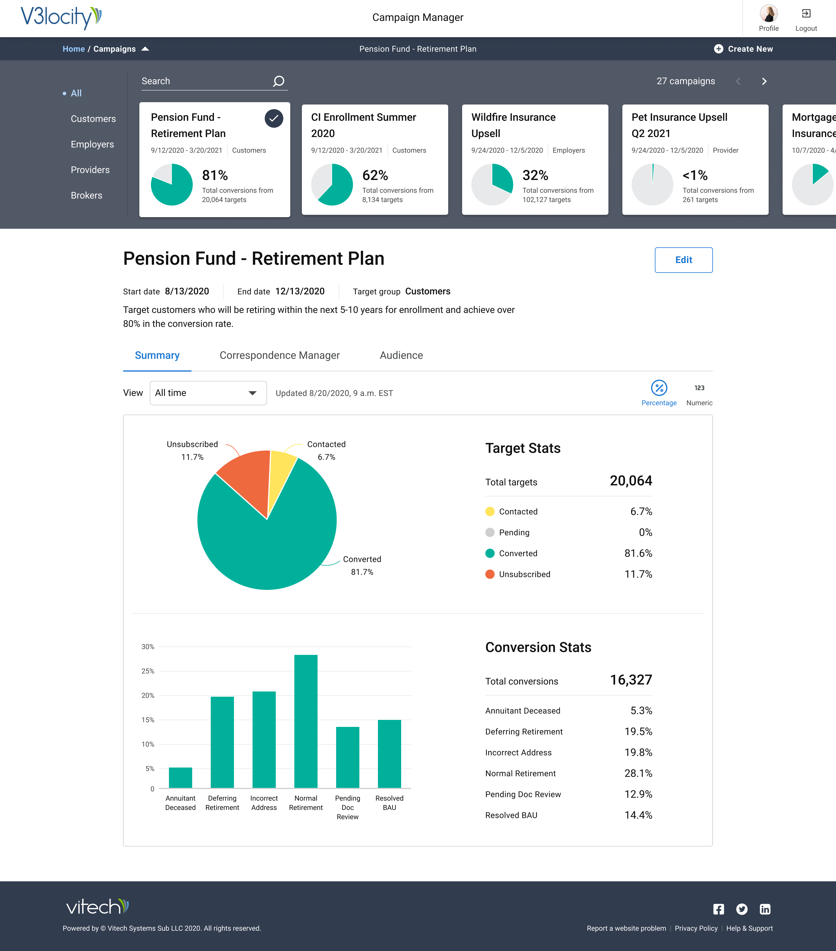
Conversions is what stands out to me.
Looks like a results dashboard.
'Edit' would make me think that I could use this to customize the dashboard setup, add/drop widgets etc. Edit the reporting not the campaign - P5 (External Test Participant)
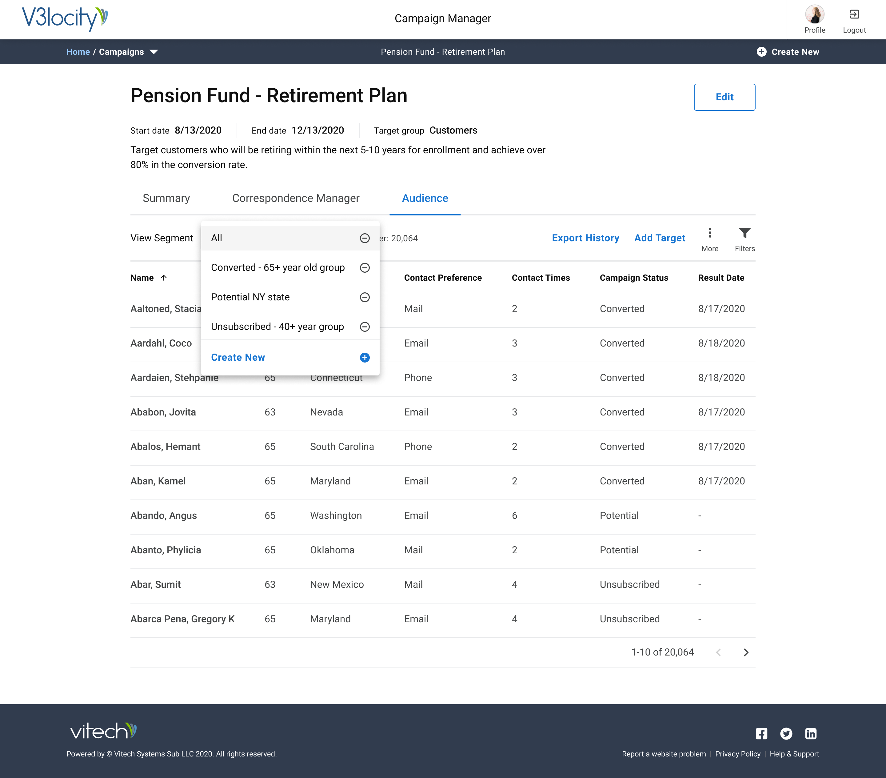
I would assume I am looking at everything and I bet there will be a Pending option in the drop down - P1 (Internal Test Participant).
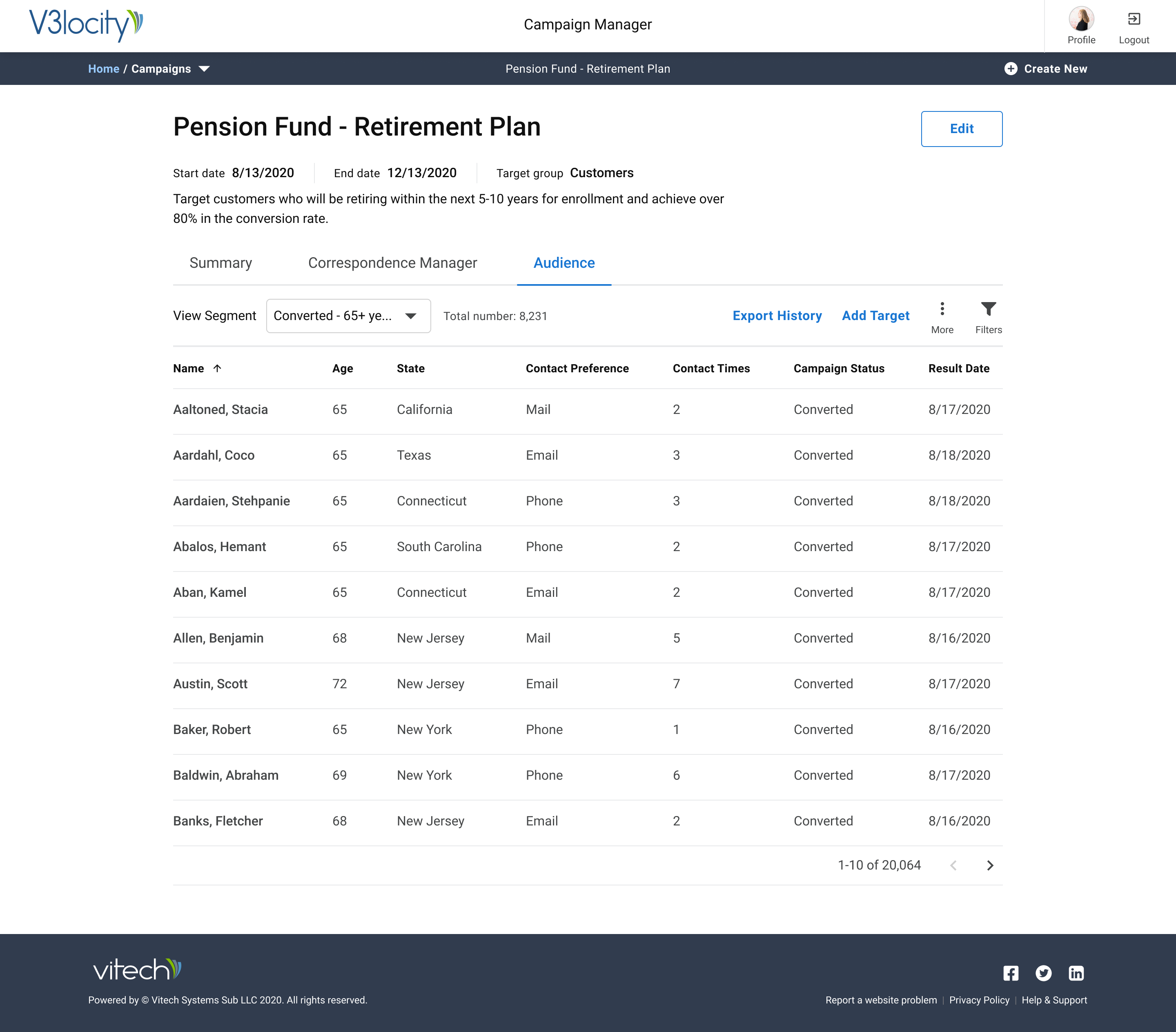
Only thing that is missing as a column is letter, email, what I am sending - P2 (Internal Test Participant)
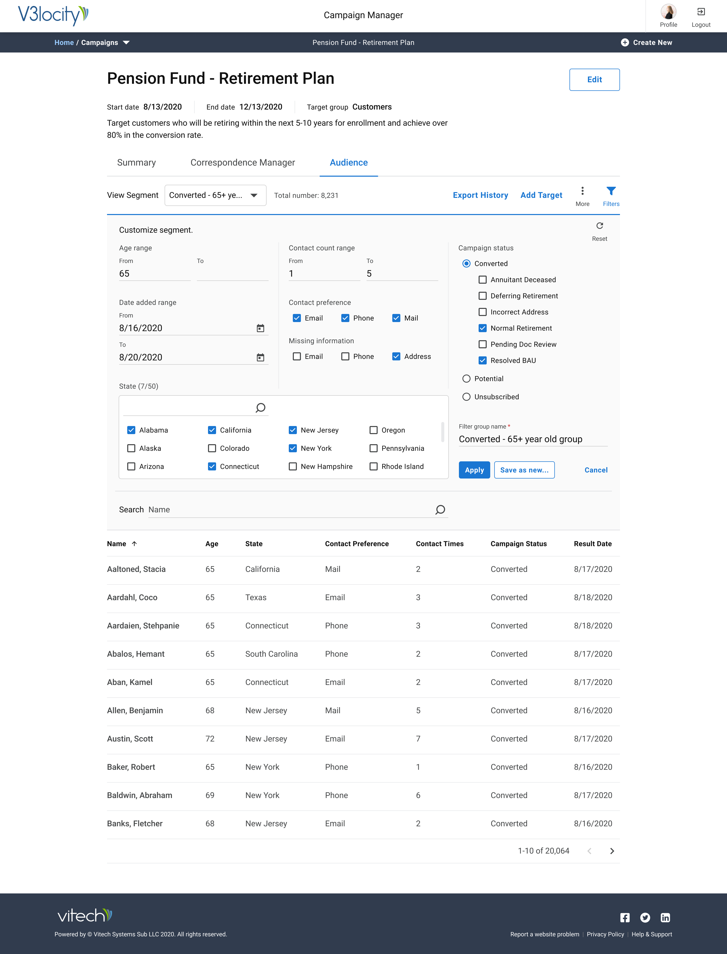
It looks like there is somewhere that I could create this filter - P4 (Internal Test Participant)
I would hope that I could drill in from here to see more details. P1 - (Internal Test Participant)
Traffic Light Report Summary of Tasks Performed by Test Participants via UX Design Concept.
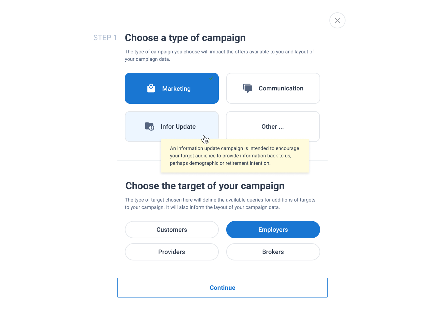
When test moderator prompted participant to choose who would be included in the campaign: “I would scroll down (the page) and I would choose the Customers.” - P1 (Internal Test Participant)
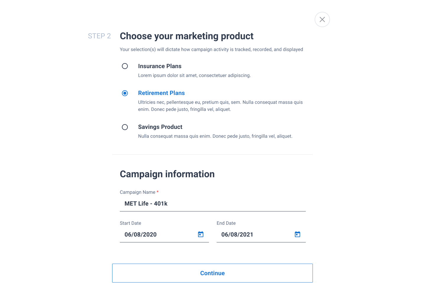
Text field for the goal is the most broadly applicable - P3 (External Test Participant
You were explaining that this is a campaign around getting people to fill out their paper works for their pension benefits, so I clicked on Members approaching retirement age. - P2 (Internal Test Participant)
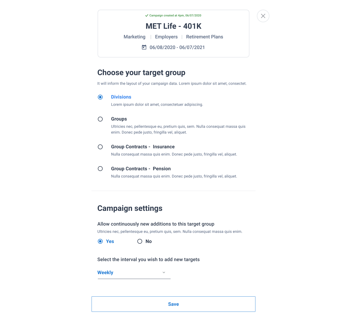
Worth looking at ESPs around the word Group because it sounds fixed - P3 (External Test Participant)
Looking at this, it looks like some different queries of people - P1 (Internal test Participant)
I would click 'Yes' so that I can add more recipients. - P1 (Internal Test Participant)
I think I can click on this because its blue - P4 (External Test Participant)
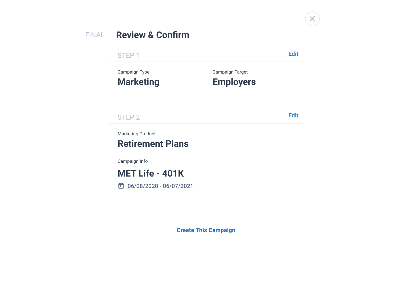
Placement of the pencil ties specifically to the name of the campaign - P1 (Internal Test Participant)
I would think, if I click edit here it would take me back to step 1 so I can make changes as necessary - P5 (External Test Participant)
This should have things that are easy for people to pull for their bosses - P3 (External Test Participant)
We looked at various SaaS campaign builders and were inspired by Hive, Monday.com and Airtable.